# 拦截复制事件并替换图片url
项目为vue
# 监听粘贴事件
/**
 * 监听粘贴事件,将外链的图片转为我们的
 */
listenPaste () {
  window.addEventListener('paste', this.pasteEventHandle)
  this.$on('hook:beforeDestroy', () => {
    window.removeEventListener('paste', this.pasteEventHandle)
  })
},
# 事件处理
- 先用html格式获取,没有则用纯文本text格式
- 将width,z-index替换为空,解决样式问题
- 有图片就拦截原生事件,替换图片为自己服务器的
- 没图片就用原生事件粘贴上去就行
async pasteEventHandle (e) {
  // Prevent the default pasting event and stop bubbling
  let paste = (e.clipboardData || window.clipboardData).getData('text/html')
  if (!paste) {
    paste = (e.clipboardData || window.clipboardData).getData('text')
  }
  // Do something with paste like remove non-UTF-8 characters
  this.pasteInfo = paste.replace(/width|z-index/g, '').replace(/[\\]/g, '')
  if (this.pasteInfo.indexOf('<img') !== -1) {
    e.preventDefault()
    e.stopPropagation()
    this.pasteInfo = await this.replaceImgInHtmlString(this.pasteInfo)
    this.pasteToTarget()
  }
},
# 获取图片并替换
用正则匹配出所有图片src,传给接口换取自己服务器链接
将字符串的图片地址替换掉,这一步写法有点蠢,待优化
实测data-src也得替换,貌似会触发懒加载然后把src又换成外链了
async replaceImgInHtmlString (paste) {
  this.showImgPasteProgress = true
  let arrImg = []
  paste.replace(/<(img) [^>]*src=['"]([^'"]+)[^>]*>/gi, function (match, $1, $2) {
    arrImg.push($2)
  })
  const replaceArrImg = await this.changeSystemUrl(arrImg)
  arrImg.forEach((item, index) => {
    paste = paste.replace(`data-src="${item}"`, `data-src="${replaceArrImg[index]}"`)
    paste = paste.replace(`src="${item}"`, `src="${replaceArrImg[index]}" style="width: 100%!important;height: auto!important;"`)
  })
  return paste
},
# 粘贴
转换图片完成后,获取光标位置,调用一系列api将内容赋值上去即可
/**
 * 粘贴到光标处
 */
pasteToTarget () {
  // Find the cursor location or highlighted area
  const selection = window.getSelection()
  // Cancel the paste operation if the cursor or highlighted area isn't found
  if (!selection.rangeCount) return false
  var div = document.createElement('div')
  div.innerHTML = this.pasteInfo
  // Paste the modified clipboard content where it was intended to go
  selection.getRangeAt(0).insertNode(div)
  this.showImgPasteProgress = false
},
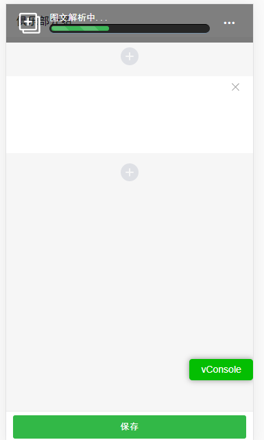
# 进度条(假)
上面已经完成了功能,下面加个动画组件,优化下体验
长这样
就直接粘代码了
<!-- 粘贴图文详情进度条组件 -->
<!-- Create by luozheng on 2020/08/10 -->
<style lang="less" scoped>
  @import "../../assets/less/variable.less";
  .progress-bar-box {
    position: fixed;
    top: 0;
    left: 0;
    right: 0;
    background: rgba(0,0,0,.5);
    z-index: 100;
    padding: 0.18rem 0.32rem;
    color: #ffffff;
    .progress-bar-item {
      width: 70%;
      height: 0.6rem;
      background: #555;
      border-radius: 0.5rem;
      padding: 0.2rem;
      box-shadow: inset 0 -0.02rem 0.02rem rgba(255, 255, 255, 0.3);
    }
    .progress-item {
      width: 100%;
      height: 0.3rem;
      background: #262626;
      padding: 0.06rem;
      overflow: visible;
      border-radius: 0.4rem;
      border-top: 0.02rem solid #000;
      border-bottom: 0.02rem solid #7992a8;
      margin-top: 0.06rem;
    }
    .progress-bar {
      border-radius: 0.4rem;
      position: relative;
      animation: animate-positive 2s;
    }
    .progress-value {
      display: block;
      padding: 0.06rem 0.14rem;
      font-size: 0.26rem;
      color: #fff;
      border-radius: 0.08rem;
      background: #191919;
      border: 0.02rem solid #000;
      position: absolute;
      top: -0.9rem;
      right: -0.2rem;
    }
    .progress-value:after {
      content: "";
      border-top: 0.2rem solid #191919;
      border-left: 0.2rem solid transparent;
      border-right: 0.2rem solid transparent;
      position: absolute;
      bottom: -0.12rem;
      left: 26%;
    }
    .active {
      animation: reverse progress-bar-stripes 0.40s linear infinite, animate-positive 2s;
    }
    .progress-bar-striped {
      background-image: linear-gradient(45deg, rgba(255, 255, 255, .15) 25%, transparent 25%, transparent 50%, rgba(255, 255, 255, .15) 50%, rgba(255, 255, 255, .15) 75%, transparent 75%, transparent);
      background-size: 0.9rem 0.9rem;
    }
    @keyframes animate-positive {
      0% {
        width: 0;
      }
    }
    .progress-bar {
      float: left;
      width: 0;
      height: 100%;
      font-size: 0.24rem;
      line-height: 0.4rem;
      color: #fff;
      text-align: center;
      -webkit-box-shadow: inset 0 -0.02rem 0 rgba(0, 0, 0, .15);
      box-shadow: inset 0 -0.02rem 0 rgba(0, 0, 0, .15);
      -webkit-transition: width .6s ease;
      -o-transition: width .6s ease;
      transition: width .6s ease;
    }
    @keyframes progress-bar-stripes {
      from {
        background-position: 0.9rem 0
      }
      to {
        background-position: 0 0
      }
    }
  }
  .paste-btn {
    width: 0.8rem;
    height: 0.8rem;
  }
  .paste-progress {
    padding: 0 0.2rem;
  }
</style>

<template>
  <div class="progress-bar-box _flex">
    <img class="paste-btn" src="//image.greenplayer.cn/share/img/icon/icon_paste.svg" alt="">
    <div class="_flex-item paste-progress">
      <div>图文解析中...</div>
      <div class="progress-item">
        <div class="progress-bar progress-bar-striped active"
             :style="{width: `${progress}%`, backgroundColor: bgColor}">
          <!--        <div class="progress-value">{{progress}}%</div>-->
        </div>
      </div>
    </div>
    <div class="paste-btn _flex" @click="clickMenu">
      <i class="ly-icon-sandian"></i>
    </div>
  </div>
</template>

<script>
  export default {
    name: 'ProgressBar',
    data () {
      return {
        progress: this.startProgress
      }
    },
    props: {
      breakPointList: {
        type: Array,
        default: () => [33, 80, 99]
      },
      bgColor: {
        type: String,
        default: '#3db657'
      },
      startProgress: {
        type: Number,
        default: 0
      }
    },
    mounted () {
      this.animationToPercent(...this.breakPointList)
    },
    methods: {
      clickMenu () {
        this.showConfirm({
          content: '确定取消图文解析吗?',
          confirm: () => {
            this.$emit('cancel')
          }
        })
      },
      animationToPercent (percent, nextPercent1, nextPercent2) {
        window.requestAnimationFrame(() => {
          if (this.progress < percent) {
            this.progress++
            this.animationToPercent(percent, nextPercent1, nextPercent2)
          } else {
            setTimeout(() => {
              percent = nextPercent1
              nextPercent1 = nextPercent2
              nextPercent2 = ''
              if (!percent) return
              this.animationToPercent(percent, nextPercent1, nextPercent2)
            }, 500)
          }
        })
      }
    }
  }
</script>