# CSS
补充:https://juejin.cn/post/6854573212337078285
# css且
.c1.c2 {}
# 盒模型
# 介绍
一个盒子由内到外由四个部分组成:margin、border、padding、content
默认情况下盒子的宽度和高度计算如下:
盒子的宽度 = width + padding-left + padding-right + border-left + border-right + margin-left + margin-right

盒子的高度 = height + padding-top + padding-bottom + border-top + border-bottom + margin-top + margin-bottom
可通过box-sizing改变计算方式:
content-box(标准盒子模型):默认值,width和height属性分别应用到元素的内容框。在宽度和高度之外绘制元素的内边距、边框、外边距。

border-box(IE盒子模型):为元素设定的width和height属性决定了元素的边框盒。就是说,为元素指定的任何内边距和边框都将在已设定的宽度和高度内进行绘制。通过从已设定的宽度和高度分别减去 边框 和 内边距 才能得到内容的宽度和高度。

inherit:规定应从父元素继承box-sizing属性的值。
# 获取和设置盒模型的宽高
- 第一种:
dom.style.width/height
这种方法只能获取使用内联样式的元素的宽和高。
- 第二种:
dom.currentStyle.width/height
这种方法获取的是浏览器渲染以后的元素的宽和高,无论是用何种方式引入的css样式都可以,但只有IE浏览器支持这种写法。
- 第三种:
window.getComputedStyle(dom).width/height
这种方法获取的也是浏览器渲染以后的元素的宽和高,但这种写法兼容性更好一些。
- 第四种:
dom.getBoundingClientRect().width/height
这种方法经常使用的场所是,计算一个元素的绝对位置(相对于视窗左上角),它能拿到元素的left、top、width、height 4个属性。
比如qTip
# 去除inline-block元素间间距的N种方法
- 元素间留白间距出现的原因就是标签段之间的空格,因此,去掉HTML中的空格,自然间距就木有了。考虑到代码可读性,显然连成一行的写法是不可取的,我们可以:
<div class="space">
    <a href="##">
    惆怅</a><a href="##">
    淡定</a><a href="##">
    热血</a>
</div>
或者是:
<div class="space">
    <a href="##">惆怅</a
    ><a href="##">淡定</a
    ><a href="##">热血</a>
</div>
或者是借助HTML注释:
<div class="space">
    <a href="##">惆怅</a><!--
    --><a href="##">淡定</a><!--
    --><a href="##">热血</a>
</div>
不推荐
使用margin负值
margin负值的大小与上下文的字体和文字大小相关,其中,间距对应大小值可以参见我之前“基于display:inline-block的列表布局”一文part 6的统计表格:
例如,对于12像素大小的上下文,Arial字体的
margin负值为-3像素,Tahoma和Verdana就是-4像素,而Geneva为-6像素。由于外部环境的不确定性,以及最后一个元素多出的父margin值等问题,这个方法不适合大规模使用。
不写结尾标签
有兼容性
<div class="space">
    <a href="##">惆怅
    <a href="##">淡定
    <a href="##">热血
</div>
肯定不推荐,idel都会报错
父元素使用font-size:0
chrome现已取消最小12px的限制
这需要考虑会不会有别的影响
letter-spacing、word-spacing
一些骚操作,不推荐
flex等改变盒布局方式
一般都这样了,除非你要在ie等考虑兼容性的浏览器上
# 行内元素可以设置padding,margin吗?
宽高不起作用
padding左右正常,
上占实际位置,会置于上层,盖住前面的元素
下不占实际位置,但是会置于图层下面

margin 左右可,上下无
# padding 百分比
根据父元素的宽度计算
是父元素,不是自己
为什么不根据自己的宽度呢?而要根据父元素?
- 如果自己没宽度怎么算
- 算了自己的,自己不又变大了,死循环
# 怪异模式和标准模式有什么区别
所谓的标准模式是指,浏览器按W3C标准解析执行代码;
怪异模式则是使用浏览器自己的方式解析执行代码,因为不同浏览器解析执行的方式不一样,所以我们称之为怪异模式。
浏览器解析时到底使用标准模式还是怪异模式,与你网页中的DTD声明直接相关,DTD声明定义了标准文档的类型(标准模式解析)文档类型,会使浏览器使用相应的方式加载网页并显示,忽略DTD声明,将使网页进入怪异模式(quirks mode)。
dtd一般指文档类型定义。 文档类型定义(DTD,Document Type Definition)
html头部的这个
<!DOCTYPE html>
这是html5的定义
# 居中布局
# 水平居中
- 行内元素:
text-align: center - 块级元素:
margin: 0 auto absolute + transformflex + justify-content: center
# 垂直居中
line-height: heightabsolute + transformflex + align-items: center
# 水平垂直居中
方法一:flex
.outer{
    display: flex;
    justify-content: center;
    align-items: center
}
方法二: position + transform, inner宽高未知
.outer{
    position:relative;
}
.inner{
    position: absolute;
    left: 50%;
    top: 50%;
    transform: translate(-50%,-50%);
}
方法三:position + 负margin, inner宽高已知
.outer{
    position: relative;
}
.inner{
    width: 100px;
    height: 100px;
    position: absolute;
    left: 50%;
    top: 50%;
    margin-left: -50px;
    margin-top: -50px;
}
方法四:设置各个方向的距离都是0,再将margin设为auto,也可以实现,前提是inner宽高已知
.outer {
    position: relative;
}
.inner {
    width: 100px;
    height: 100px;
    position: absolute;
    top: 0;
    right: 0;
    bottom: 0;
    left: 0;
    margin: auto;
}
# flex
# flex-direction
方向 row column
# flex-wrap
换行方式 倒着换行等
flex-direction 和 flex-wrap 可以简写成 flex-flow 。 flex-flow 使用时可以只显式设置一个值,也可以显式设置两个值:
flex-flow只显式设置一个值,并且该值和<flex-direction>相匹配时,flex-wrap会取值initialflex-flow只显式设置一个值,并且该值和<flex-wrap>相匹配时,flex-direction会取值initialflex-flow显式设置两个值时,flex-direction和flow-wrap没有先后顺序之分,即可flex-flow: column wrap和flex-flow: wrap column等同
# justify-content
主轴方向的对齐方式
space-between 会让第一个Flex项目的盒子起始边缘与Flex容器主轴起点相稳合,最后一个Flex项目的盒子结束边缘与Flex容器主轴终点相稳合,其它相邻Flex项目之间间距相等。当Flex容器中只有一个Flex项目时,其表现行为和 flex-start 等同
space-around 会让第一个Flex项目的盒子起始边缘与Flex容器主轴起点间距和最后一个Flex项目的盒子结束边缘与Flex容器主轴终点间距相等,并且等于其他相邻两个Flex项目之间间距的一半。当Flex容器中只有一个Flex项目时,其表现行为和 center 等同
space-evenly 会让第一个Flex项目的盒子起始边缘与Flex容器主轴起点间距和最后一个Flex项目的盒子结束边缘与Flex容器主轴终点间距相等,并且等于其他相邻两个Flex项目之间间距。当Flex容器中只有一个Flex项目时,其表现行为和 center 等同
# align-items
侧轴方向对齐
# flex-basis与width的区别
单独配,宽度就是配的那个 都配了,哪个大用哪个(待确定)
# flex: 1超出时
将width设为0
# grid
比flex强大很多
网格系统,相当于二维的布局
有兼容问题,用得少
# 基础用法
<div class="wrapper">
  <div class="one item">One</div>
  <div class="two item">Two</div>
  <div class="three item">Three</div>
  <div class="four item">Four</div>
  <div class="five item">Five</div>
  <div class="six item">Six</div>
</div>
.wrapper {
  margin: 60px;
  /* 声明一个容器 */
  display: grid;
  /*  声明列的宽度  */
  grid-template-columns: repeat(3, 200px);
  /*  声明行间距和列间距  */
  grid-gap: 20px 50px;
  /*  声明行的高度  */
  grid-template-rows: 100px 200px;
}
.one {
  background: #19CAAD;
}
.two {
  background: #8CC7B5;
}
.three {
  background: #D1BA74;
}
.four {
  background: #BEE7E9;
}
.five {
  background: #E6CEAC;
}
.six {
  background: #ECAD9E;
}
.item {
  text-align: center;
  font-size: 200%;
  color: #fff;
}
通过grid-template-columns 和 grid-template-rows来控制行和列
# fr 关键字
Grid 布局还引入了一个另外的长度单位来帮助我们创建灵活的网格轨道。fr 单位代表网格容器中可用空间的一等份。grid-template-columns: 200px 1fr 2fr 表示第一个列宽设置为 200px,后面剩余的宽度分为两部分,宽度分别为剩余宽度的 1/3 和 2/3。代码以及效果如下图所示:
.wrapper-3 {
  display: grid;
  grid-template-columns: 200px 1fr 2fr;
  grid-gap: 5px;
  grid-auto-rows: 50px;
}
# minmax() 函数
我们有时候想给网格元素一个最小和最大的尺寸
grid-template-columns: 1fr 1fr minmax(300px, 2fr) 的意思是,第三个列宽最少也是要 300px,但是最大不能大于第一第二列宽的两倍
# 位置处理
justify-items 、align-items
start | end | center | stretch;
看起来是改变内部元素(文字等)的左中右。而不是该元素的位置
justify-content 、align-content
start | end | center | stretch | space-around | space-between | space-evenly;
这就跟flex的差不多,只是名字有点区别
# 兼容性
兼容不太好,用的也不多
适合瀑布流的布局
# 三栏布局
三栏布局是很常见的一种页面布局方式。左右固定,中间自适应。实现方式有很多种方法。
第一种:flex
flex-basis 给个默认宽度,屏幕不够分则自动缩小
<div class="container">
    <div class="left">left</div>
    <div class="main">main</div>
    <div class="right">right</div>
</div>
.container{
    display: flex;
}
.left{
    flex-basis:200px;
    background: green;
}
.main{
    flex: 1;
    background: red;
}
.right{
    flex-basis:200px;
    background: green;
}
第二种:position + margin
<div class="container">
    <div class="left">left</div>
    <div class="right">right</div>
    <div class="main">main</div>
</div>
body,html{
    padding: 0;
    margin: 0;
}
.left,.right{
    position: absolute;
    top: 0;
    background: red;
}
.left{
    left: 0;
    width: 200px;
}
.right{
    right: 0;
    width: 200px;
}
.main{
    margin: 0 200px ;
    background: green;
}
第三种:float + margin
<div class="container">
    <div class="left">left</div>
    <div class="right">right</div>
    <div class="main">main</div>
</div>
body,html{
    padding:0;
    margin: 0;
}
.left{
    float:left;
    width:200px;
    background:red;
}
.main{
    margin:0 200px;
    background: green;
}
.right{
    float:right;
    width:200px;
    background:red;
}
注意清除浮动
第4种 table
<div class="container">
  <div class="left">left</div>
  <div class="main">main</div>
  <div class="right">right</div>
</div>

.container {
  display: table;
  width: 100%;
}
.left {
  width: 200px;
  background: red;
  display: table-cell;
}
.main {
  background: green;
  display: table-cell;
}
.right {
  width: 200px;
  display: table-cell;
  background: red;
}
table布局性能开销大,不建议使用
**第五种 grid **
.container {
  display: table;
  width: 100%;
  display: grid;
  grid-template-rows: 100px;
  grid-template-columns: 300px auto 300px;
}
.left {
  background: red;
}
.main {
  background: green;
}
.right {
  background: red;
}
# 选择器
*匹配所有
不建议直接使用,影响性能,每个元素都会带上。
看了reset.css,是用具体标签做初始化的。
#id
不常用,一般都是用class,id用来js获取元素
.class
li a
后代选择器,不建议层级过多
单个元素选择器
X:visited and X:link
a:link { color: red; }
a:visted { color: purple; }
我们使用
:link伪类来定义所有还没点击的链接。另外还有
:visited伪类可以让我们给曾经点击过或者访问过的链接添加样式。x + y
后面的第一个元素
x > y
直接的子代
x ~ y
后面的元素
X[title]、 X[href="foo"]
属性选择器,
X:checked
X:after
X:hover
X:not(selector)
过滤某个
X:nth-child(n)
从1开始
X:nth-last-child(n)
# 权重计算方式
| 选择器 | 权重值 |
|---|---|
| !important标识 | 10000 |
| 行内样式 | 1000 |
| id选择器 | 100 |
| 类、伪类、属性选择器 | 10 |
| 标签选择器 | 1 |
| 通配符 * | 0 |
CSS基本选择器包含ID选择器、类选择器、标签选择器、通配符选择器。
选择器 从右往左 解析
一般建议不超过三层
CSS 的覆盖顺序与标签内 class 定义的顺序无关,只与 style 中加载的顺序有关
[class*=" ly-icon-"], [class^=ly-icon-]

*包含   ^开头
比较方式:
如果层级相同,继续往后比较,如果层级不同,层级高的权重大,不论低层级有多少个选择器。
# !important在什么场景用
换肤之类的
实在不好改了的时候才用,不然还是加多几个选择器去增加权重
# BFC
BFC的全称为 Block Formatting Context,块级格式化上下文,是一个独立的渲染区域,让处于 BFC 内部的元素与外部的元素相互隔离,使内外元素的定位不会相互影响。
IE下为 Layout,可通过 zoom:1 触发
- 触发条件:
- 根元素
position: absolute/fixeddisplay: inline-block, table, flex, gridfloat元素ovevflow!==visible
- 规则:
- 属于同一个 BFC 的两个相邻 Box 垂直排列
- 属于同一个 BFC 的两个相邻 Box 的 margin 会发生重叠
- BFC 中子元素的 margin box 的左边, 与包含块 (BFC) border box的左边相接触 (子元素 absolute 除外)
- BFC 的区域不会与 float 的元素区域重叠
- 计算 BFC 的高度时,浮动子元素也参与计算
- 文字层不会被浮动层覆盖,环绕于周围
- 应用:
- 阻止
margin重叠 - 可以包含浮动元素 —— 清除内部浮动(清除浮动的原理是两个
div都位于同一个 BFC 区域之中) - 自适应两栏布局
- 可以阻止元素被浮动元素覆盖
- 阻止
# 清除浮动
常见有四种方法
额外标签法()
在最后一个浮动标签后添加一个标签,给其设置clear:both
.clear{
	clear: both;
}
优点:通俗易懂,方便
缺点:添加无意义标签,语义化差
父级添加overflow属性(不推荐)
通过触发BFC方式,实现清除浮动
.fahter{
	width: 400px;
	border: 1px solid deeppink;
	overflow: hidden;
}
优点:代码简洁
缺点:内容增多的时候容易造成不会自动换行导致内容被隐藏掉,无法显示要溢出的元素
使用after伪元素清除浮动(推荐使用)
.clearfix:after{/*伪元素是行内元素 正常浏览器清除浮动方法*/
	content: "";
	play: block;
 height: 0;
 clear:both;
 visibility: hidden;
}
.clearfix{
	*zoom: 1;/*ie6清除浮动的方式 *号只有IE6-IE7执行,其他浏览器不执行*/
}
优点:符合闭合浮动思想,结构语义化正确
缺点:ie6-7不支持伪元素:after,使用zoom:1触发hasLayout.
使用before和after双伪元素清除浮动(推荐使用)
.clearfix:after,.clearfix:before{
    content: "";
    display: table;
}
.clearfix:after{
    clear: both;
}
.clearfix{
	*zoom: 1;
}
优点:代码更简洁
缺点:用zoom:1触发hasLayout.
# position属性
position属性的重要性应该没啥可说的了。想必谁都回答的上来。
absolute绝对定位,相对于static定位以外的第一个父元素进行定位。relative相对定位,相对于其自身正常位置进行定位。fixed固定定位,相对于浏览器窗口进行定位。static默认值。没有定位,元素出现在正常的流中。inherit规定应该从父元素继承 position 属性的值。sticky粘性布局,在视口时表现为relative,否则为fixed,注意兼容性s
但是要注意一个问题,absolute 是相对于父元素的哪个属性进行定位的?通过下面的例子我们来看一看。
.container{
    position: relative;
    width: 30px;
    height: 30px;
    margin: 20px;
    border: 10px solid red;
    padding: 10px;
    background: blue;
}
.inner {
    position: absolute;
    width: 10px;
    height: 10px;
    top: 0;
    left: 0;
    background: pink;
}
从上图可以看出,是相对于 static 定位以外的第一个父元素的 padding 来定位的。
CSS3中新增了一个 position:sticky 属性,该属性的作用类似 position:relative 和 position:fixed的结合。元素在跨越特定阈值前为相对定位,之后为固定定位。必须指定 top, right, bottom 或 left 四个阈值其中之一,才可使粘性定位生效。否则其行为与相对定位相同。但 sticky 尚在实验性阶段。
# 如何实现一个自适应的正方形
方法1:利用CSS3的vw单位
vw 会把视口的宽度平均分为100份
.square {
    width: 10vw;
    height: 10vw;
    background: red;
}
复制代码
方法2:利用margin或者padding的百分比计算是参照父元素的width属性
.square {
    width: 10%;
    padding-bottom: 10%;
    height: 0; // 防止内容撑开多余的高度
    background: red;
}
# 层叠上下文
元素提升为一个比较特殊的图层,在三维空间中 (z轴) 高出普通元素一等。
- 触发条件
- 根层叠上下文(
html) position- css3属性
flextransformopacityfilterwill-change-webkit-overflow-scrolling
- 根层叠上下文(
- 层叠等级:层叠上下文在z轴上的排序
- 在同一层叠上下文中,层叠等级才有意义
z-index的优先级最高
# 有哪些引入方式?通过link和@import引入有什么区别?
CSS引入方式有4种 内联、内嵌、外链、导入
内联:直接写在html标签上
内嵌:html中写style标签内
外链 link 除了可以加载css之外,还可以定义rss、rel等属性,没有兼容性问题,支持使用javascript改变样式
导入@import 是css提供的,只能用于加载css,不支持通过javascript修改样式
页面被加载的时候,link会被同时加载,而@import则需等到页面加载完后再加载,可能出现无样式网页
如今在打包的条件下(webpack等),会将import的css编译成一份css并通过link引入,所以用这种写法没什么问题。
# 预处理器(Sass/Less/Postcss)
CSS预处理器的原理: 是将类 CSS 语言通过 Webpack 编译 转成浏览器可读的真正 CSS。在这层编译之上,便可以赋予 CSS 更多更强大的功能,常用功能:
- 嵌套
- 变量
- 循环语句
- 条件语句
- 自动前缀
- 单位转换
- mixin复用
面试中一般不会重点考察该点,一般介绍下自己在实战项目中的经验即可~
# less循环
@speed:0.2s;//这个是动画的执行时间
@delay: 2s;
.loop(@n) when (@n > 0) {
  .couplet-item@{n}{
    animation: couplet-item 0.2s linear (@delay + @n*@speed) forwards;
  }
  //循环调用自身
  .loop((@n - 1));
}
.loop(20) ;
# node-sass安装不上
查看当前环境适用的binding.node
node -p "[process.platform, process.arch, process.versions.modules].join('-')"到这里 (opens new window)下载对应版本的文件。https://github.com/sass/node-sass/releases(开翻墙)
将下载好的文件放入缓存目录中 npm缓存目录:C:Users你的用户名AppData/Roaming/npm-cache/node-sass/4.13./win32-x64-72_binding.node
# 动画
# 属性介绍
transition: 过渡动画
transition-property: 属性transition-duration: 间隔transition-timing-function: 曲线transition-delay: 延迟- 常用钩子:
transitionend
animation / keyframes
animation-name: 动画名称,对应@keyframesanimation-duration: 间隔animation-timing-function: 曲线animation-delay: 延迟animation-iteration-count: 次数
infinite: 循环动画
animation-direction: 方向
alternate: 反向播放
animation-fill-mode: 静止模式
forwards: 停止时,保留最后一帧backwards: 停止时,回到第一帧both: 同时运用forwards / backwards
常用钩子:
animationend
动画属性: 尽量使用动画属性进行动画,能拥有较好的性能表现
translatescalerotateskewopacitycolor
# transition与animation对比
transition相当于是个过度动画,需要有过渡效果才会触发。一般用来做元素的放大缩小、平移旋转等简单的操作。transition只执行一次,当需要执行多次时,一般会利用:hover等时机或者使用javaScript改变类名进行控制。 两个关键帧之间的补间动画效果animation需要自己设定关键帧,可以做相对复杂的操作,比如延迟、循环播放等。一般在需要比较复杂的情况才会使用animation。
# 启用gpu will-change
will-change: auto;
will-change: scroll-position;
will-change: contents;
will-change: transform;        /* <custom-ident>示例 */
will-change: opacity;          /* <custom-ident>示例 */
will-change: left, top;        /* 两个<animateable-feature>示例 */

/* 全局值 */
will-change: inherit;
will-change: initial;
will-change: unset;
# 具体写法
# 重新开始动画
原理 移除动画类再添加上
将节点的class列表转成数组
找到带动画字符的那一个 删掉

let classArr = Array.prototype.slice.call(target.classList)
let delItem = classArr.find((item) => {
  return item.indexOf('animation') !== -1
})
target.classList.remove(delItem)
再加上,这里用了个小技巧,将剩下的类名替换一些字符就成了动画的类名

let classArr = Array.prototype.slice.call(target.classList)
let animationClass = classArr[0].replace('bg', 'animation')
if (+this.areaId === 234 && animationClass === 'animation-city2') {
  animationClass = animationClass + '-sz'
}
setTimeout(() => {
  this.$nextTick(() => {
    target.classList.add(animationClass)
  })
}, 500)
# classList
dom.classList

dom.classList.add(xx)

dom.classList.remove(xx)
# 动画事件
animationstart  开始
animationend	结束
animationiteration	重复开始
# 写法
animation: city2-sz 1s linear 2.5s forwards infinite alternate;
forwards 保持结束状态
infinite 循环播放
alternate 轮流反向播放动画
steps(1) 按帧显示
# 暂停
animation-play-state: paused
# Lottie 动画
方便设计师直接从ae导出json的动画,跨端使用
用的svg或者canvas,比直接操作div性能要更好
# 低端机上用 CSS 动画做么
效果复杂的话可能会卡顿,可以通过translate3d之类的开启gpu来提高性能。
用定位等脱离文档流的属性,减少回流
# 题目
写个动画,一个盒子,开始时缩放是 0,50%时是 1,100%时是 0,开始结束都是慢速,持续 2 秒,延迟 2 秒,结束后固定在结束的效果
.left {
  width: 300px;
  height: 300px;
  background-color: red;
  position: absolute;
  left: 0;
  right: 0;
  animation: left linear 2s 2s alternate;
}
@keyframes left {
  0% {
    transform: scale(0);
  }
  50% {
    transform: scale(1);
  }
  100% {
    transform: scale(0);
  }
}
一个地球本身在自转,外面有个飞机围着它转,飞机的螺旋桨自己也在转,有哪些需要考虑的点
骨骼动画:需要联动的部分需要考虑dom结构
用transform做动画,减少回流
开启gpu
# border
# border:none和border:0px有什么区别
最简单的一个例子: 从border: 10px;过渡到border: none;,是不会有动画的; 从border: 10px;过渡到border: 0px;,是可以有动画的。
感觉border:0px浏览器解析并给border-width设置0px这个值;border:none浏览器解析后会给border-style设置为none;浏览器会先分析border的style再分析width,所以我感觉border:none会比border:0px节省性能(最后一点我猜的)
# 颜色
冷知识
没设置边框颜色时取color的
# css单位适配
# rem
(function(doc, win) {
    var docEl = doc.documentElement,
        resizeEvt = 'orientationchange' in window ? 'orientationchange' : 'resize',
        recalc = function() {
            var clientWidth = docEl.clientWidth;
            if (!clientWidth) return;
            docEl.style.fontSize = 20 * (clientWidth / 375) + 'px';
        };
    if (!doc.addEventListener) return;
    win.addEventListener(resizeEvt, recalc, false);
    doc.addEventListener('DOMContentLoaded', recalc, false);
})(document, window);
px2rem
结合webpack的插件,实现编译阶段将px自动转为rem
原理
根据html节点的字体大小做1rem
ie9+支持
# vw、vh
根据屏幕的百分比
1vw = 1/100 屏幕宽度
ie11才支持
# rpx
小程序用的
# select
改原生样式
/*去掉默认的下拉三角*/
appearance:none;
-moz-appearance:none;
-webkit-appearance:none;

border: none;

/*添加下拉三角图标*/
background: url("../img/task5-2_07.jpg") no-repeat right center transparent;
# 滚动
# 隐藏滚动条
直接写个全局的滚动属性,加上这个就完事了
&::-webkit-scrollbar {
  display: none;
}
# iOS滚动不流畅
-webkit-overflow-scrolling: touch;
# 过渡效果
scroll-behavior: smooth;
# 超出省略
单行
overflow: hidden;
text-overflow:ellipsis;
white-space: nowrap;
多行
display: -webkit-box;
-webkit-box-orient: vertical;
-webkit-line-clamp: 2;
overflow: hidden;
英文换行
默认单词是连在一起的
word-break: break-all;
# 图片
# 宽自动,高最多100%,居中
position: relative;
display: inline-block;
width: auto;
max-height: 100%;
top: 50%;
left: 50%;
transform: translate(-50%, -50%)
# 宽最多100%,高自动,居中
position: relative;
display: inline-block;
max-width: 100%;
height: auto;
top: 50%;
left: 50%;
transform: translate(-50%, -50%)
# 图片cover
object-fit: cover;
在html2canvas中无效,一般用应该是可以的
# 背景图cover
background-size: cover;
background-position: center center;
background-repeat: no-repeat;
# 矢量图和位图的理解
矢量图放大不模糊
位图(像素图)是直接通过像素显示,画质在一开始就决定了,放大会模糊
遇到复杂的图片,比如大量阴影、复杂元素时矢量图更耗资源,此时位图更合适
# 视差效果
background-attachment
# 九宫格图片
css
.img-ul {
  width: 100%;
  padding: 0 0.25rem;
  .img-li {
    width: 33.33%;
    padding: 0 .04rem .04rem 0;
    display: inline-block;
    box-sizing: border-box;
    vertical-align: top;	// 去除inline-block之间的间隙
    .img-box {
      padding-bottom: 100%;		// 动态获得高度
      background-color: #c46a6a;
      position: relative;
      img {
        background-size: cover;
        background-repeat: no-repeat;
        background-position: 50%;
        position: absolute;
        width: 100%;
        height: 100%;
      }
    }
  }
}
dom
<ul class="img-ul">
  <li v-for="item in [1,2,3,4]" class="img-li">
    <div class="img-box">
      <img src="" alt="" class="_fullimg">
    </div>
  </li>
</ul>
# 背景图渐变
background-image: linear-gradient(rgba(255,255,255,0),rgba(255,255,255,1));
# filter滤镜
# 全局黑白效果
html加上
filter: grayscale(100%);
# 文字
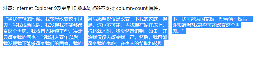
# 多列显示
column-count: 3;
# 两端对齐
width: 100px;
text-align-last: justify;
# 模糊效果
.blurry {
    color: transparent;
    text-shadow: 0 0 5px rgba(0,0,0,0.5);
}
# 竖向排列
writing-mode: vertical-lr;
# 字体
@font-face {
    font-family: kaiti;
    src: url('../../../assets/font/kaiti.ttf');
  }
# 动态生成
setFontFace () {
        let newStyle = document.createElement('style')
        this.fontFamilyList.map((item) => {
          newStyle.appendChild(document.createTextNode(`
          @font-face {
            font-family: ${item.fontFamily};
            src: url(${item.file});
          }
          `))
        })
        document.head.appendChild(newStyle)
      },
# 文字下划线
text-decoration underline
发现离的太近了 直接用border + padding 解决
# input
# focus-within
父元素获取焦点后将子元素改变样式
&:focus-within {
  .input-title {
    font-size: 0.24rem;
    color: @mainColor;
  }
}
# placeholder
&.green::-webkit-input-placeholder{
  color: @mainColor;
  font-weight: 500;
}
# textarea
# 去掉右侧滚动条,去掉右下角拖拽
    overflow:hidden;
    resize:none;
# 兼容ie
# *display:inline
这个是一种CSS hack写法 IE6识别和_, 不识别 !important IE7识别, 不识别_,识别 !important 而firefox两个都不识别, 识别 !important
# 响应式布局
# 媒体查询
@media (max-width: 600px) {
  .facet_sidebar {
    color: red;
  }
}
# 切换主题色
https://www.cnblogs.com/leiting/p/11203383.html
- 写多份颜色样式,通过js切换link
- less有个修改less变量的功能
- css有个var(--themeColor),通过js切换这个变量即可
# 技巧类
# 三角形
方法一
原理:通过边框,三边透明,需要的那边不透明,夹出一个三角形
&:before {
  position: absolute;
  content: '';
  display: inline-block;
  width: 0;
  height: 0;
  border: solid transparent;
  border-width: 0.1rem;
  border-bottom-color: rgba(25, 31, 37, 0.96);
  top: -0.2rem;
  right: 0.22rem;
}
方法二
利用CSS3的clip-path属性
不了解 clip-path 属性的可以先看看 MDN 上的介绍:chip-path (opens new window)
.triangle {
    width: 30px;
    height: 30px;
    background: red;
    clip-path: polygon(0px 0px, 0px 30px, 30px 0px); // 将坐标(0,0),(0,30),(30,0)连成一个三角形
    transform: rotate(225deg); // 旋转225,变成下三角
}
方法三
主要是边框,空心的
通过两个方法一的实心三角形叠加在一起,这么做兼容性好
用border然后旋转的方式兼容性不好
.company-code-hover:before {
    box-sizing: content-box;
    width: 0px;
    height: 0px;
    position: absolute;
    top: -16px;;
    left: 25px;
    padding:0;
    border-bottom:8px solid #FFFFFF;
    border-top:8px solid transparent;
    border-left:8px solid transparent;
    border-right:8px solid transparent;
    display: block;
    content:'';
    z-index: 12;
}
.company-code-hover:after {
    box-sizing: content-box;
    width: 0px;
    height: 0px;
    position: absolute;
    top: -18px;;
    left: 24px;
    padding:0;
    border-bottom:9px solid #cccccc;
    border-top:9px solid transparent;
    border-left:9px solid transparent;
    border-right:9px solid transparent;
    display: block;
    content:'';
    z-index:10
}
# 光晕效果
background: radial-gradient(#fff 0%, rgba(255, 255, 255, .3) 35%, rgba(255, 255, 255, .2) 60%, rgba(255, 255, 255, 0) 70%);
用百分比来多段显示 制造边缘模糊效果
# 弧形背景
  .all-amount {
    width: 100%;
    height: 2.76rem;
    position: relative;
    &:after {
      content: '';
      width: 100%;
      height: 100%;
      position: absolute;
      bottom: 0;
      z-index: 1;
      border-radius: 0 0 50% 50%;
      background-color: @maincolor;
      background-position: center center;
      background-size: 100% 100%;
      background-repeat: no-repeat;
    }
  }
# 1px边框
1、用图片、不方便
2、动态改变viewport的缩放比例
<meta name="viewport" content="initial-scale=0.5, maximum-scale=0.5, minimum-scale=0.5, user-scalable=no">
// js获取
// 通过id找到后修改.content

// 或者document.getElementsByTagName('meta'),找出所有meta,再根据getAttribute('name') 循环找出viewport
3、伪类 + transform
原理是把原先元素的 border 去掉,然后利用 :before 或者 :after 重做 border ,并 transform 的 scale 缩小一半,原先的元素相对定位,新做的 border 绝对定位
- 单条 border
.hairlines li{
    position: relative;
    border:none;
}
.hairlines li:after{
    content: '';
    position: absolute;
    left: 0;
    background: #000;
    width: 100%;
    height: 1px;
    -webkit-transform: scaleY(0.5);
            transform: scaleY(0.5);
    -webkit-transform-origin: 0 0;
            transform-origin: 0 0;
}
- 四条 border
.hairlines li{
    position: relative;
    margin-bottom: 20px;
    border:none;
}
.hairlines li:after{
    content: '';
    position: absolute;
    top: 0;
    left: 0;
    border: 1px solid #000;
    -webkit-box-sizing: border-box;
    box-sizing: border-box;
    width: 200%;
    height: 200%;
    -webkit-transform: scale(0.5);
    transform: scale(0.5);
    -webkit-transform-origin: left top;
    transform-origin: left top;
}
样式使用的时候,也要结合 JS 代码,判断是否 Retina 屏
if(window.devicePixelRatio && devicePixelRatio >= 2){
    document.querySelector('ul').className = 'hairlines';
}
可以支持圆角
改viewport会影响整个页面,老项目还是得用伪类解决。
# 渐变线
:style="{backgroundImage: `linear-gradient(90deg, ${themeColor} 0%, #ffffff 100%)`}"
# clip-path
circle 圆形
.in {
    animation: clipCircleIn .6s;
}
@keyframes clipCircleIn {
    0%   { clip-path: circle(0); }
    100% { clip-path: circle(200px); }
}
语法
circle(半径 at 圆心坐标) 圆心坐标默认50% 50% 即中心
polygon 三角形
@keyframes clipTriangleIn {
    0%   {
        clip-path: polygon(50% 50%, 49% 51%, 51% 51%);
    }
    100% {
        clip-path: polygon(50% -100%, -100% 150%, 200% 150%);
    }
}
inset 矩形圆角
@keyframes clipRectIn {
  0%   {
    clip-path: inset(50% round 10% 50%);
  }
  100% {
    clip-path: inset(0% round 0);
  }
}
更多花里胡哨的
https://www.zhangxinxu.com/wordpress/2019/05/css-transfer-animation/
# 允许复制
.copy-content {
  /*user-select:text!important;*/
  -webkit-touch-callout: initial!important;
  div {
    user-select:text!important;
    -webkit-touch-callout: initial!important;
  }
}
# contenteditable
实现placeholder
&:empty:before{
  content: '我来说两句...';
  color: gray;
}
# flex 竖向 子元素宽度
加上解决子元素宽度100%问题
align-self: baseline;